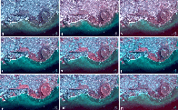
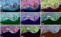
Having seen that we can produce color images that respond to the different light-reflecting properties of different materials, we can now experiment with combinations of wavelengths in order to see how the colors change.
In this view, we keep two of the bands constant for each of the nine images (the blue channel on your monitor is Band 1, and the green channel is band 2). The red channel on your monitor is then used for bands 3, 4, 5 etc. for each of the nine images. This technique is particularly good for showing where vegetation is highly reflective, since in bands 7, 8, 9 and 10 we can see areas such as the golf course and Diamond Head as bright red areas.
We saw in our diagram of the electromagnetic spectrum ( Page 1 ) that some of the TMS channels are close together in wavelength and some are far apart. It is the difference in light reflecting properties over narrow wavelength regions that lets remote sensing people map out different units on the ground, so that here we show the contrast between successive TMS channels. We can see from the labels at bottom left that first we use bands 1, 2 and 3 as the blue, green and red channels on the monitor. Then we use bands 2, 3, and 4 for the same monitor channels, an so on.
Particularly interesting here is the fact that some parts of the spectrum produce very bland colors. Basically, we only start to see contrasts when we use Band 6 (see page 1 once again for the TMS wavelengths). There is great contrast in the band 6, 7, 8 image, and in the 8, 9, 10 image. One would use these wavelengths if we wanted to produce a map of the differences in parts of Honolulu (e.g., vegetation, bare soil, buildings, etc.).
 [784x487 JPEG]
  [785x485 JPEG]